
Redesigning the sandwich building experience.
To see the final prototype, click HERE.
Background
In 2019, Subway closed over 1,000 locations nationwide, with more closures announced for 2020. With the pandemic, dependence on loyalty programs for continued business has increased dramatically.
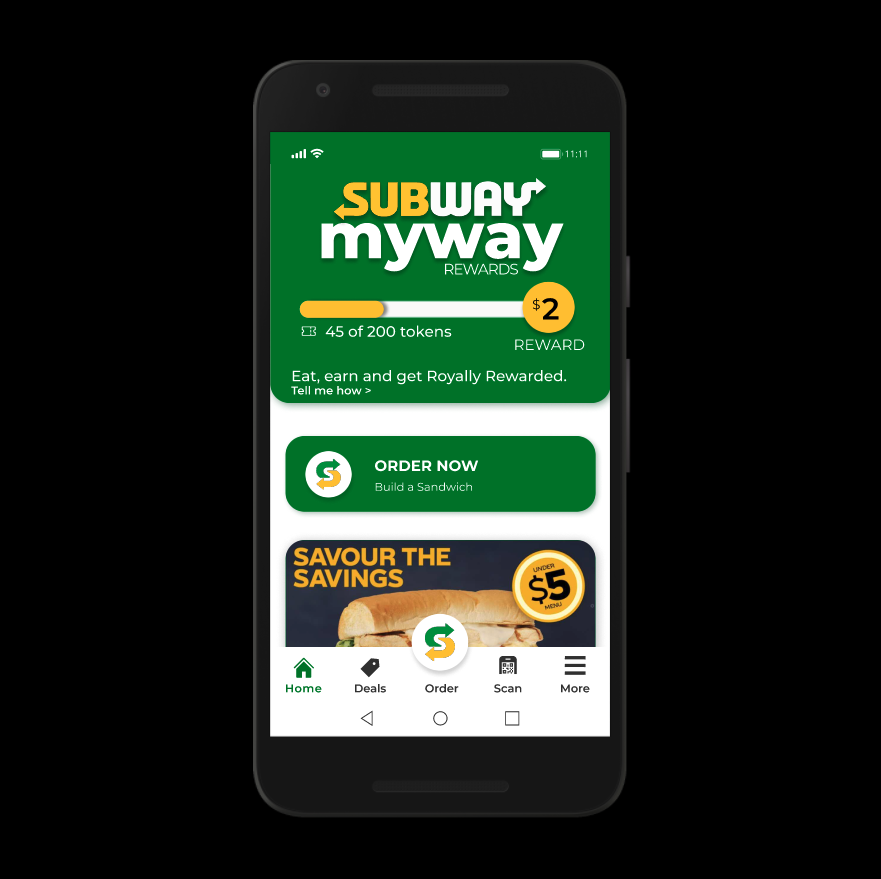
While the app has been generally positively reviewed, some written reviews tell a different story, mentioning that “it’s not the most user friendly, but not the worst,” and that “it’s difficult to get my sandwich exactly right.”
With this in mind, we asked:
How might we improve the app’s customer experience to retain existing Subway customers?
Conducting an evaluation
To explore what could be improved, we conducted a heuristic evaluation to assess the usability of building and ordering a sandwich within the Subway app.
We went through each screen within the core flow, giving components severity ratings on key heuristics taken from Jakob Nielsen’s 10 Usability Heuristics for Interaction Design.
Synthesizing our findings
Having analyzed each screen, we summarized our findings as overarching themes that we could use to guide our intervention:
Cannot see sandwich status
Awkward to move backward/forward through flow
Visual clutter & lack of consistency
Additionally, there were some key high-priority issues with error recovery, where users had a difficult time returning to the proper state after viewing an error message.
Knowing what the major usability problems were, we began to look at how competitors, like the Skip the Dishes, overcame these design problems - especially given that they were building the same sandwiches in their app.
Analyzing their flow, we found that they valued simplicity over engagement.
Rethinking sandwich-making
With our synthesized data, we began the redesign, taking into account each of our findings for each new screen.
To see the final prototype, click HERE.
Building a UI Library
To prepare for potential developer hand-off, we built a UI library, including plenty of documentation and supporting annotations to help clarify interactions and intended functionality.
Some examples are shown below.
Next Steps
Moving forward, we would want to conduct usability testing on our redesign, to ensure that the usability actually does improve given the new changes. Ideally, this would have been done prior to making a high-fidelity prototype, but we expedited the process due to time constraints.
Main Takeaway
“Fun” features can conflict with simplicity and usability.
Though the idea of actually building a sandwich in the app to simulate the in-person Subway experience can be engaging, the usability trade-offs may sometimes not be worth it - particularly when comparing the existing Subway app experience to simpler screen flows from food delivery apps.
Once we were able to shed the novelty of having each ingredient and its picture displayed throughout our redesign, we found that many usability issues were more easily resolved.